dumbnail.gif)
Colour
The Complementary Contrast
|
At the 19th century the french physicist Michel Eugéne Chevreul discovered the simultaneous contrast. Each color creates its complementary colour. |
Im 19. Jahrhundert entdeckte der franzoesische Physiker Michel Eugéne Chevreul den Simultankontrast. Jede Farbe erzeugt ihre Gegenfarbe. |
|
Test Focus on the coloured square of a test picture with your eye (from a distance of 4 to 6"). a) At the edges of the square the background seems to change its colour after a while. Be patient! b) After the square disappears (after 20 seconds), at the same spot you can perceive another colour. This colour is complementary to the original colour - it's the complementary colour. |
Test Pictures / Testbilder
|
Test Fixiere die Farbflaeche eines Testbildes mit dem Auge (aus einer Entferung von 10 bis 15cm). a) An den Raendern derselben scheint sich die Hintergrundsfarbe nach einer gewissen Zeit zu veraendern. Geduld! b) Nachdem die Fläche verschwindet (nach 20 Sekunden), nimmt man an der gleichen Stelle eine andere Farbe wahr. Diese Farbe entspricht dem Gegenwert, dem Komplement der urspruenglichen Farbe - der Komplementaerfarbe. |
|
Explanation It's a special trait of the human perception, that we highlight the edge, the contour of an object. Thus the object is set off his background to ease the spacial orientation. In front of a bright background the background at the edge of a dark object seems to be lighter than the rest (and vice versa). The contrast is enhanced. Perceiving colours this phanomen is being transfered to the colour-tones. The colour with the strongest contrast is created - the complementary colour. Because the colour and its complementary appear simultaneously, it's called simultaneous contrast. This leads to the effect that when arranging colours next to each other they have a mutual influence on their perceived colour-tone. |
Erklaerung Unserer Wahrnehmung ist es zu eigen, dass wir den Rand, die Kontur eines Gegenstandes hervorheben. (Konturensehen) Damit wird dieser von seinem Hintergrund abgesetzt, die raeumliche Orientierung wird erleichtert. (Figur-Grund Prinzip) Vor einem hellen Hintergrund erscheint der Hintergrund am Rand eines dunklen Gegenstandes noch heller (und umgekehrt). Der Kontrast wird verstaerkt. Bei der Wahrnehmung von Farben uebertraegt sich dies auf die Farbwerte. Die Farbe mit dem groessten Kontrast wird erzeugt - die Komplementaerfarbe. Da die Farbe und ihre Komplementaerfarbe gleichzeitig auftreten, spricht man von einem Simultankontrast. Dies bedingt auch, dass bei nebeneinanderliegenden Farben, sich diese in ihrem wahrgenommenen Farbwert gegenseitig beeinflussen. |
|
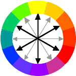
Using the primary colours (look at Colour Part 1/Basics) the following pairs of complementary colours are created: Yellow - Violet, Red - Green, Blue - Orange. Itten's Color Circle shows these as opposite colours in the outer circle. The complementary colour of a primary colour is the mixed colour of the two other primary colours. This applies not only to the primary colours, also each intermediate tone has its complement. E.g. the complementary colour of red-orange is blue-green. |
|
Aus den Grundfarben (siehe Colour Part 1/Basics) ergeben sich die Komplementaerfarbenpaare: Gelb - Violett, Rot - Gruen, Blau - Orange. Im Farbkreis Ittens entsprechen diese den jeweils gegenueberliegenden Farben im aeusseren Ring. Die Komplementaerfarbe zu einer Grundfarbe ist die Mischfarbe der beiden anderen Grundfarben. Dies trifft natuerlich nicht nur auf die Grundfarben zu, auch jeder Zwischenton hat sein Komplement. So ist zum Beispiel die Komplementaerfarbe von Rotorange - Blaugruen. |
|
In painting, but also in the advertising branch the contrast of complementary colours - complementary contrasts are used to highlight something or to create an enticing or aggressive general mood.
Hints/Painting By mixing complementary colours you get grey (in theory black), because the values of the colours are neutralized. (Compare Part 1, additive and subtractive color mixing) Because colours in painting are rarely totally pure, you can get nice, greyish or brownish tones of a broad variety by mixing two (untrue) complementary colours (or all three primary colours). |
In der Malerei, aber auch in der Werbung werden Komplementaerfarben als Kontrast - Komplementaerkontraste eingesetzt, um Dinge hervorzuheben oder eine anregende bzw. aggressive Grundstimmung zu erzeugen.
Praxis-Tip/Malerei Beim Mischen von Komplementaerfarben erhaelt man Grau (theoretisch Schwarz), da sich die Farbwerte aufheben. (Vergleiche Part 1, additive und subtraktive Farbmischung) Da Farben in der Malerei selten ganz rein sind, lassen sich durch die Mischung von (nicht exakten) Komplementaerfarben (oder der drei Grundfarben) schoene, differenzierte Grau- oder Brauntoene erzeugen. |

art.)watchers
home
-
Free for educational use only -
Copyright © R.Strasser . 1996/97. All rights reserved.